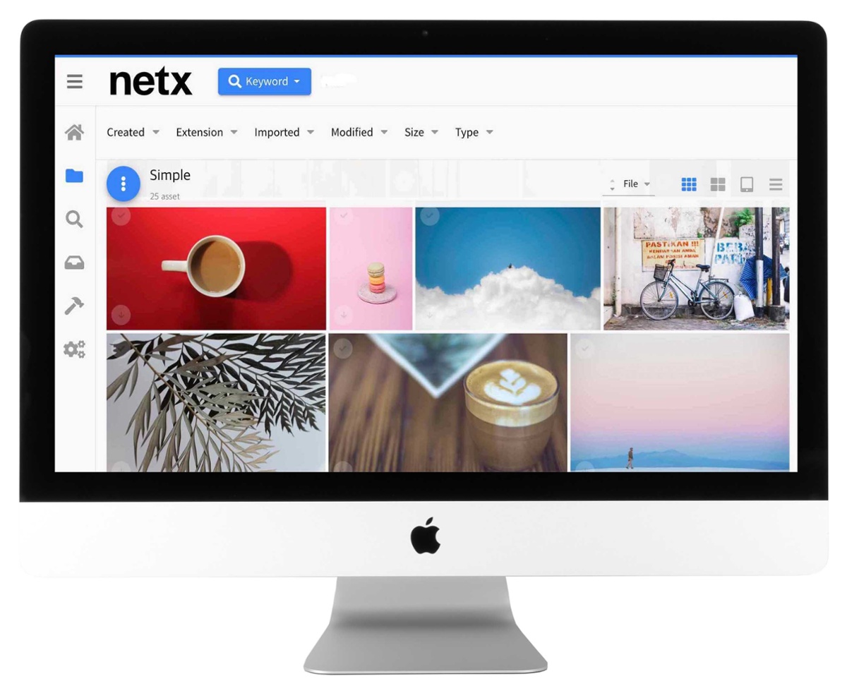
Four years ago, we launched a new user interface that remade NetX into an easy-to-use, responsive web application. Since then, we’ve continued to evolve the UI with the belief that powerful and intuitive digital asset management should be accessible to everyone, including those with disabilities.
That’s why we’re excited about the latest refresh of our UI. In NetX 9, we’ve incorporated Google’s Material Design, a set of UI components and standards that helps us deliver a unified, inclusive experience across the entire NetX platform. “The goal was to implement a maintainable design system that speeds up our development process and enhances usability for all users,” said Spence Kiddle, Head of Engineering and Product. “We chose Material Design because of its widespread adoption and well-thought-out use cases. In doing so, the complexity of our UI codebase was reduced significantly and future enhancements are less likely to introduce bugs or workflow frustrations.”
What’s changed? We focused this release on the following improvements:
There’s a lot of love in the new redesign, and we’re just getting started. Moving forward, we are working on better mobile support, snappier data loading, and more feedback to users about what’s going on the app. And of course, a continued commitment to greater accessibility. Do you have suggestions for how we can improve? Check out our Ideas Portal to submit and vote for your favorite enhancements. Together, we can make a better NetX for everyone!
1435 NW Northrup Street
Portland OR 97209
Call us: (503) 499-4342
Gleimstrasse 52
10437 Berlin
Germany